5 min read
Your Branding Should Evolve

.webp)
Share
I have been obsessed with Crumbl since it hit my town. Not only are the cookies delicious, but I also love the business concept and marketing they have developed.
My first introduction to Crumbl was a TikTok video by the Co-founder Sawyer Hemsley. I was intrigued by the idea that he created a cookie business based solely on creating the best chocolate chip cookie.
In their story on their website, they describe doing everything backwards, from buying their first storefront and all the baking equipment before even having a recipe for the cookies they needed to make. But when I examine their story over the last 6 years, all I see is the forward-thinking decisions that made them so successful.
But what I really want to talk about today is two weeks ago, Crumbl unveiled new branding. And, of course, it is polarizing to most. One reddit thread I read started with, “There is no way they got rid of the chef for this super basic logo, anyone else seen the new app logo yet?”
I think to most consumers, these changes may seem unnecessary, but as a marketer, you might see the why behind the changes. But what I think is vastly overlooked is why brands should evolve or update their branding. This contradicts the notion that your branding is permanent, which is what most people would think. We often work with clients who are so nervous to update their branding that the lack of change is actually hurting them more than just changing it. Branding done right means strategically changing and evolving over time to match the company and your audience.

If you are not familiar with their branding or concept, let’s review what they were. Above is their old logo, with the Cookie Chef and full name Crumbl Cookies, and signature pink box.
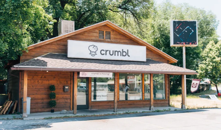
Their original store only said Crumbl on their sign. My guess is when they began franchising they added “Cookies” to the name. This was an incredibly smart branding choice at the time because without knowing anything about Crumbl you knew instantly they were all about cookies because it was in the name.
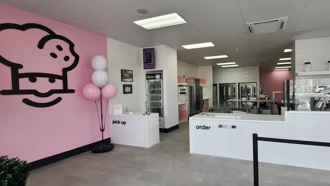
Their branding was always clear and simple; it included all the elements for the masses to quickly learn who and what they were. It allowed them to grow quickly among all the other things that made them unique, like their changing menu every week to create exclusivity and encourage cookie lovers to come back each week to try their new flavors.
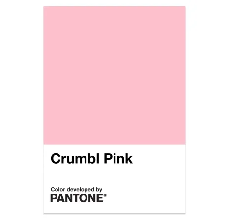
Earlier this year, they also made their signature pink Pantone official. “Creating a definitive standard would help ensure the Crumbl brand experience is consistent across all products and locations.” This is a strategic branding choice first to protect their signature color and add depth to their brand story.
So why change their branding???
I will tell you this was not an overnight decision. I know it was many months in the making, with a lot of back and forth. They likely involved a branding agency, their marketing team, in-house graphic designers, as well as all the stakeholders at Crumbl. The branding changes they made were all strategic and well thought out.
There were probably many factors that played into this decision, but I think the most obvious is that their branding has not changed much since they opened their first store 6 years ago. They, as a company, have evolved and grown. Going from 1 store in Utah to over 800+ stores across the US and over 23,000+ employees with over 257 flavors created. With millions of followers across their social media channels.
Changing branding for any business is a costly endeavor. The initial cost vs. potential return should always be considered. It is not as simple as updating your website and social media. It affects everything: signs, boxes, employee uniforms, messaging, graphics, collaborations, potentially the color of walls in every store, etc… You get the picture.
Your branding must reflect who you are. If you have changed, then your brand should probably change, too.
Without further ado, let’s dig into Crumbl’s new branding.
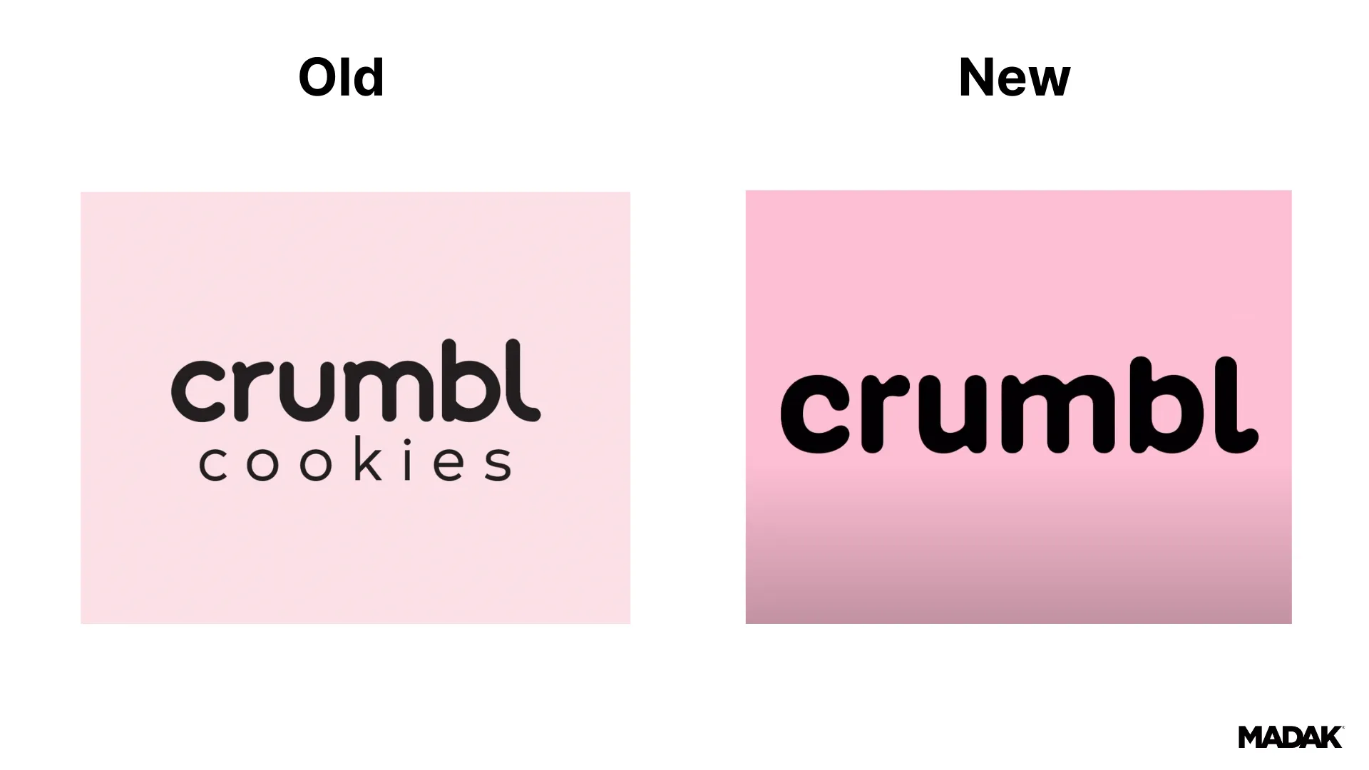
Crumbl without the “cookies” seems like a big change. But is it? I mean, I personally only ever refer to them as just “Crumbl.” And at this point, everyone should know they sell delicious cookies. It had become redundant and no longer needed in the logo. This is a very typical logo/name evolution for companies that have gained such notoriety. Think “Pepsi” they once were “Pepsi Cola Drink.” We all know what Pespi is and that they are more than just cola. So, removing cookies from the name seems like a natural evolution. Also, it might mean Crumbl is expanding what they offer, more merchandise and other food items…who knows? They did already test out ice cream in some stores…
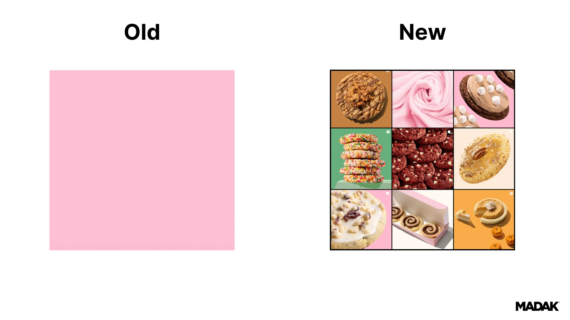
They added more colors. They are known for their signature Crumbl Pink. But I know from experience that only having one brand color is incredibly limiting to all of your marketing across so many different types of mediums. Their growth also means they are doing things they never thought about doing and definitely need more versatility in their brand to market themselves appropriately. Plus, I personally think it makes their brand way more interesting and creates depth. Their signature Crumbl Pink is still the most important color, but with good design and strategic color placement, they will only enhance their brand.
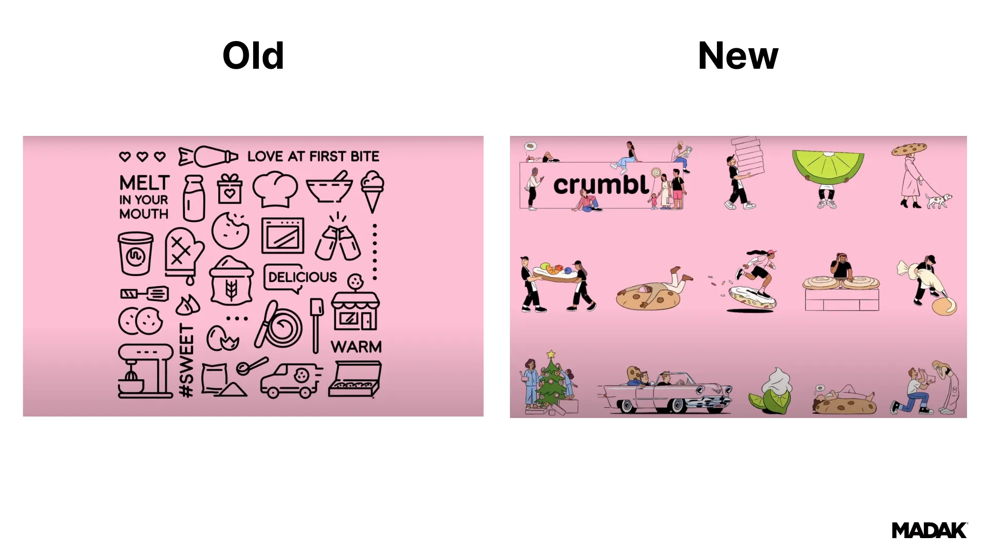
Another big change was to their classic black line icons and graphics. They have moved to custom lifestyle graphics that are colorful and add more character to their visuals. First, I think this is very on-trend. We have definitely seen an uptick in the use of lifestyle graphics in branding recently. I also peep a pink Cadillac in there which hints at their origin story. These lifestyle graphics invoke more emotion and tell more of their brand story. Emotion is heavily linked with authenticity and trust, so it makes sense that they have made this switch. I personally loved their old custom icons and graphics because of their simplicity, but they are beginning to look a bit outdated. Their new graphics showcase who they have become, add depth to their story, and give them an opportunity to be colorful without taking away from their original brand.
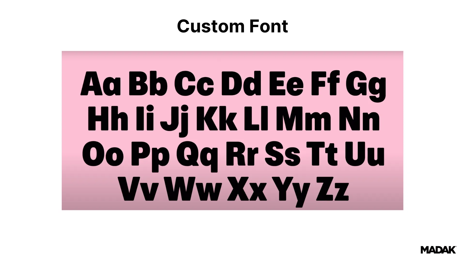
They also added a new custom font. This is next-level thinking. When brands grow, they need to find ways to set themselves apart, and a font is something they could utilize. The font will become synonymous with their brand. (We all know the Disney font.) But I think another big reason they did this is to prevent others from stealing their branding, which, when you’re as cool as Crumbl, you could imagine people have tried.
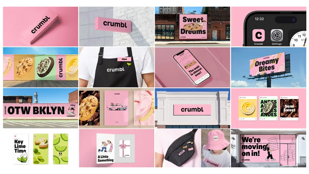
There is not much out there from their team yet, but I did find a quote from Sawyer talking about the new branding. He said, “This is not a complete rebrand, but rather enhancements to the brand we’ve built a solid foundation upon,” and that the goal was “to infuse new life and energy into Crumbl while maintaining our core values.”
To the untrained eye, this branding update may seem drastically different from their original, but I agree with Sawyer it is an enhancement or, better, a natural evolution of their brand. Highlighting where they have been and where they are going.
Branding should evolve, but I would like to clarify that it should evolve strategically and methodically. Otherwise, your brand will look like a hot mess because branding should be cohesive and consistent throughout all of your marketing. Confusing your customers or potential customers doesn’t help anyone.
Learn more about creating a strong brand foundation and if you have questions about your branding or wonder if it is time to evolve, let’s chat.
Image Sources:
https://youtu.be/V5-uC-9VgMA?si=NdS2a2dwZBMGmUB
https://www.bakemag.com/articles/18282-crumbl-unveils-brand-refresh
Related Blogs
Lorem ipsum dolor sit amet, consectetur adipiscing elit, sed do eiusmod tempor incididunt ut labore et dolore magna aliqua. Ut enim ad minim veniam, quis nostru.

How to Build Team Connections While Working Remotely
Despite the benefits that come with working remotely, it’s not faultless—it can be difficult for colleagues to make meaningful and collaborative connections when a screen is always separating them. With the shift to remote and hybrid working environments over the past several years, businesses of all sizes are wondering how to build and maintain strong team connections remotely. Keep reading for a brief overview of why building connections at work is so important and how to make sure you and your team members can do so even when you can’t be face-to-face.

How to Make Time for Professional Development
Making time for professional development is essential to support your long-term success. This can be a daunting task for many of us, as the modern professional world is undoubtedly a busy one. There’s always something that needs doing, and when you add all of the responsibilities from your personal life on top of that, it seems like there’s almost no time left. Keep reading to get a better understanding of what professional development is, why it’s so important, and how to prioritize it even with a busy schedule.

How to Boost Brand Awareness
Brand awareness generally refers to how well customers recognize a specific brand or product based on its name or defining features. In other words, how many people are familiar with your brand and are able to remember it in the right circumstances? Typically, the idea behind growing your brand awareness is to become a more well-known and authoritative figure in your industry. Companies with higher levels of brand awareness usually generate more sales, have more loyal customers, and can introduce new services/products more easily. Boosting brand awareness is essential for any company that wants to grow and secure a position for itself in the market, as most people tend to “buy the name” rather than the product. In fact, 71% of consumers reported that they would like to recognize the name of a brand they purchase from. So, how can you boost your brand awareness? Keep reading to find out.
Reimagine Your Digital Impact
Transform your website, pitch decks, sales collateral and more, all with transparent, upfront, pricing.