5 min read
Logo Do’s and Don’ts

Share
“Ok, but where do I put the logo?” If you’ve ever slapped your logo on a post and called it good enough (we’ve all done it) this blog is for you! Logos are probably the most recognizable element of your brand, but they can be tough to incorporate into collateral. How big should they be? Where do they get placed? What if it doesn’t show up against your background? I’ll review some of the most common mistakes I see in logo usage and some guidelines to keep in mind.
Logo Size
To start with an obvious one, how big should your logo be? Well, context is key. Two inches on a social media post is drastically different than two inches on a billboard, so I usually consider it more in terms of ratio/percent of the collateral. It also depends on what the point of the collateral is. Is it facing an audience of followers who already know you, or introducing someone to your brand for the first time?
DON’T: Make it so small that it cannot be easily read.
DO: Consider whether your logo is necessary for this piece of collateral
If you find yourself making your logo too small to really read, ask yourself if it’s even necessary to include it in this piece of collateral. In some cases, social media posts for example, viewers will usually be able to see your logo in your profile picture and user name of the post and therefore your logo isn’t critical to include in the image itself. Maybe consider if there’s an alternative version of your logo available (usually the icon without text) that you can use instead to keep it legible but small. In other cases, however, ex) paid media ads, brochures, posters etc, the collateral will not have any surrounding context and therefore needs to include a larger and highly legible logo.

DON’T: Make your logo so large that it’s the first thing people see (Hot Take, I know)
DO: Size according to who your audience is and how familiar they are with your brand.
Okay, so yes, there are absolutely cases when it’s okay to have an ENORMOUS logo ex) business or product launches, your storefront sign, the back of a business card etc, but those instances are rare. In general, if your collateral is aimed at imparting information to an audience that’s already familiar with your brand, your logo can be smaller (see the point above about making it too small). Collateral that’s specifically aimed at reaching a new audience should have a more prominent logo. Even in those cases when you want the logo to be large for new audiences, ex) A billboard, a poster, etc, the logo probably isn’t going to be what catches people’s eye. Instead, it’s going to be a large, catchy headline or a cool image/graphic. You want to allow people to be drawn in by those things and say “That’s cool, what brand is that?” and then immediately see your logo. That’s why companies always put their logos nice and big at the end of commercials.

Logo vs. Background
It’s inevitable that at some point you’ll need to use your logo in a situation where it’s very hard to see against the background. Whether it’s the background color itself, or a photo that the logo wants to blend in with, here are a couple of things to keep in mind to help your logo stay visible.
DON’T: Edit your logo (rotate, color change etc.) to make it more visible
DO: Consider approved alternative logos and supporting elements
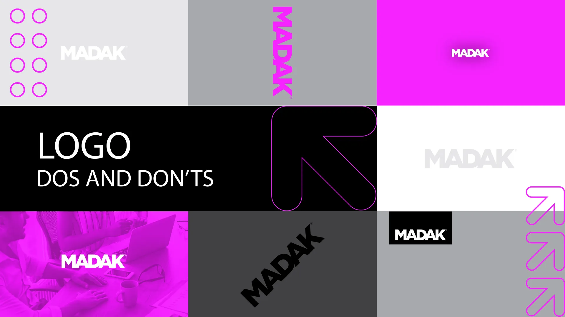
It’s tempting to edit the logo or rotate it slightly to make it stand out against a difficult background, but I promise there are better ways! The very first question to always ask is if your brand includes an approved alternative logo that might work better. For example, many brands include an all-white, or all-black version of the logo, which will often show up better against complex backgrounds. A second method for helping your logo show up is to add a slight drop-shadow to the logo, which helps neutralize the background enough to make the logo legible. (Be careful not to over-use this though, it starts to look lazy if done too strongly or too often). A third option, when all else fails, is to add a solid (usually white) box for the logo to sit on. This looks most professional when it’s located near an edge and the white box runs off the edge (see example below).

DON’T: Place your logo against a background that’s a similar color or value
DO: Consider ways to make the background better support your logo
In most cases, your logo has been designed to look best against your brand colors. If you find yourself creating visual assets whose backgrounds deviate from your brand colors, you should first consider if it’s really necessary. But what about photos, you ask? Great point! If text legibility is the most important consideration, you can add a color overlay to your photo. (Turn your image black+white, and then add a solid black, white, or brand color over it with ~80-90% opacity or at a level that looks good.) Full-color images will always be the most impactful and I do recommend you use them whenever possible. In those cases strategic cropping and logo placement is key. Look for areas of your photo where there is negative/low-complexity space to house your logo ex) Sky, Grass, Floor, Blank Wall etc.

Placement
And finally, let’s return to our original question: “So where does the logo GO?” Now that we’ve discussed all the other elements - size, background, and color, let’s discuss placement. Again, there’s not a single right answer but here are some tips for professional-looking placement.
DON’T: Just put your logo anywhere and call it good
DO: Strategically place your logo in professional locations (corners & edges)
Any of the corners - but especially top-left and bottom-right - are very common locations for logos. Center-top and center-bottom are also good locations, but should usually only be used if the rest of the text/content in the collateral is also center-aligned to match.
DON’T: Place your logo too close to the edge or to text/content
DO: Include padding (also called “buffer” or “white-space”) around your logo
Some brand guides include a “white-space logo” which defines how you should calculate the blank area left around your logo. You can calculate this yourself by choosing an average element height ex) a letter in your logo, and leaving a minimum of that much space on all sides of your logo (see example below). This will allow your logo breathing room and less tension by running up against an edge or text in your collateral, helping it look much cleaner and professional.

In conclusion, there are so many caveats and variables involved in logo placement, but there are still some best practices to follow to make your logo stand out. It all comes down to intentional usage, considering what purpose your collateral serves, who your audience is, and how you set your logo up for the best visibility in the circumstances!
Dig in deeper and read Why Visuals Are Important in Marketing.
Thanks for reading and have a fantastic Madak Monday!
Related Blogs
Lorem ipsum dolor sit amet, consectetur adipiscing elit, sed do eiusmod tempor incididunt ut labore et dolore magna aliqua. Ut enim ad minim veniam, quis nostru.
8 Tips to Grow Your Email List
Many online publications may try to convince you that email marketing is dead, but as always, you can't believe everything you read online! In fact, to this day, email marketing remains one of the best ways to maximize your business's profit, as the return on investment (ROI) is one of the highest out of all marketing methods (about $36 in return for every $1 spent). Research has shown that almost 100% of consumers check their email on a daily basis. This process occurs on multiple devices: laptops, tablets, work PCs, and of course, mobile phones. Therefore, if your email marketing campaign is well-made and you have a healthy email list, it can significantly benefit your business. Of course, for an email marketing campaign to work, you need to have subscribers, which brings us to the topic of today's article—growing your email list. Below, we will look at eight practical tips to help you get more email subscribers and build your list.

11 TikTok Content Ideas for Businesses
With over one billion users, TikTok can be a useful platform for business owners to promote their products and services if they navigate it correctly. Unfortunately, the sheer amount of content that is posted on TikTok daily can make it difficult for brands to get noticed. Not only is there already pressure to create noticeable and entertaining content, but most TikTok users tend to be turned off by advertisements. Because of this, it’s important that whatever videos you make for your business come across as authentic, personable, and relatable. It can be hard to know where to start, but let’s take a look at some ideas that can help you gain traction and promote your product.

10 Proven Ways to Reduce Your Bounce Rate
Reducing your website’s bounce rate is one of the best things you can do to boost user engagement and site rankings, eventually increasing customer conversions. Many people lack knowledge on what constitutes a good vs. bad bounce rate and how to reduce it. First things first—according to Semrush, “a bounce rate of 56% to 70% is on the high side,” and “an optimal bounce rate would be in the 26% to 40% range.”If your website is struggling to get attention and it’s challenging for you to find leads from web traffic, it might be time to look at what you can do to reduce your bounce rate. Keep reading!
Reimagine Your Digital Impact
Transform your website, pitch decks, sales collateral and more, all with transparent, upfront, pricing.